Vida Case Study
Vida Care UK mission is to empower the elderly to stay in their homes longer by using innovative
technology to help
monitor their wellbeing while providing proficient carers to help take care of the rest.

Vida noticed that the design and layout of their website did not fit with the new direction of the company.
Vida Care had just won two funding grants to help them build innovative health monitoring systems for the elderly to
help detect if they may be showing symptoms for easily managed health conditions. With this grant Vida was centring
their future around the technology they could provide and felt that the website didn’t reflect this new direction yet,
Vida didn’t want to take away from their overall message of caring for the elderly.
Vida also noticed that many potential carers were emailing them about job vaccines as they were struggling to find the
job applications online.
This needed to change, so they hired me to help solve these problems.


PART 1: Reviewing Vidacare.com google analytics and performing a content audit on the previous website to find pain
points and underperforming pages.
For the first part of the research phase for Vida’s redesign, I began with an audit of the older Vida website, along
with an analysis of their google analytic account. At the time of the audit, Vida was looking for several caregiver
roles which allowed me to easily see where potential carers were getting frustrated.
I then could use google analytic to help identify other key pain points from the previous UX architecture and
information on the current users.
From this information, I was able to acquaint 3 targeted users that I wanted to concentrate my in-depth interviews with.
PART 2: Using Targeted personas and in-depth interviews with those personas to help guild the VIP of the website.
To help align Vida’s brand with the current direction of the company I also relied on in-depth interviews with targeted
personas of the new brand. I used these interviews to redefine the user journey and define the VIP of the website.
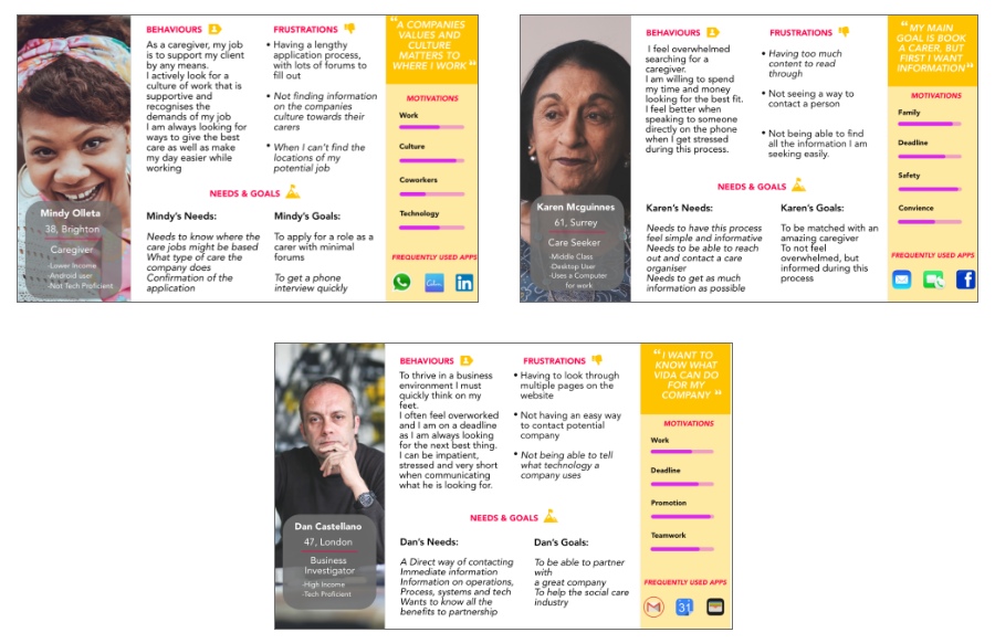
The targeted personas I interviewed were the caregivers currently working for Vida. The care seekers, such as the
relatives of the elderly looking to get care for their loved ones. The last persona that of the business investor, this
persona is outside of the care community but who wants to know about Vida’s technology and how they can invest.
Taking the collective answer from the interviews of each targeted persona I established the needs, frustrations and
behaviours to help lead the redesign.

Using Targeted personas and in-depth interviews with the personas to help guild the VIP of the website.
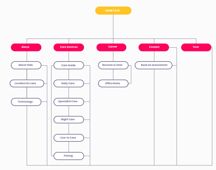
While performing my content audit on the Vida care website I noticed that many pages were not easily accessible from the
navigation bar, and were nested inside of other pages. One of these pages was the current roles within Vida tech and the
current caregiver roles available. This was one of the pain points identified. I also wanted to make sure that all the
pages were visible from the Navbar sot that no pages were nested in another one. The in-depth interviews with the
targeted personas also helped to re-define the user’s flow while on the website based off of the needs of each group.
These created my VIPS for my site map.

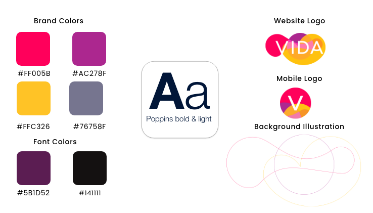
The brand identity was predetermined by the previous designer, but to create a modern UI design I added a new typeface
and background illustrations to the brand guidelines.
After finishing the UX architecture of the website I moved on to the brand guidelines. I held a workshop with the
operation manager and the head of the product of Vida to define their brand attributes. We ultimately decided to keep
the colors and main logo the same but wanted to change the font, create a mobile logo and add some details for extra
styling.

Mid-fidelity wireframes mapping the basic outline of the website.
The wireframes presented are mid-fidelity and the groundwork for the new user experience of the website. The idea was to
add all the informations the personas would need, but also have it organised in an accessible way. A big fix was the
navigation and how the information could be accessed from any page on the website.
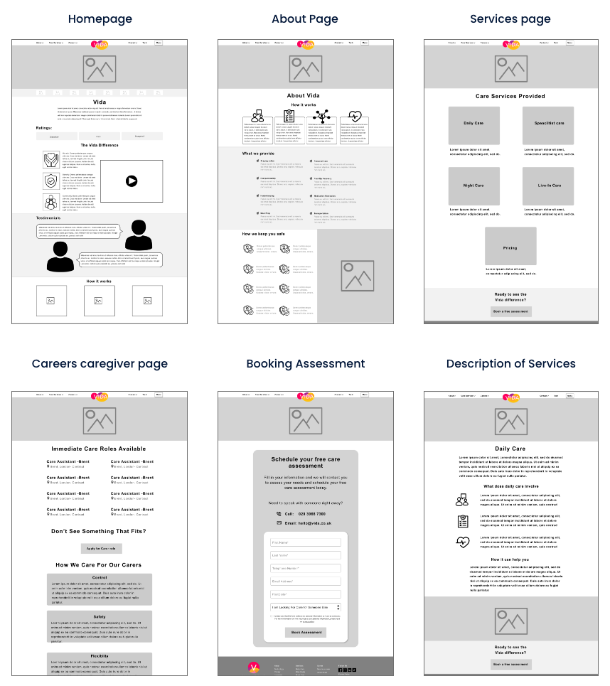

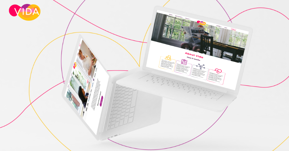
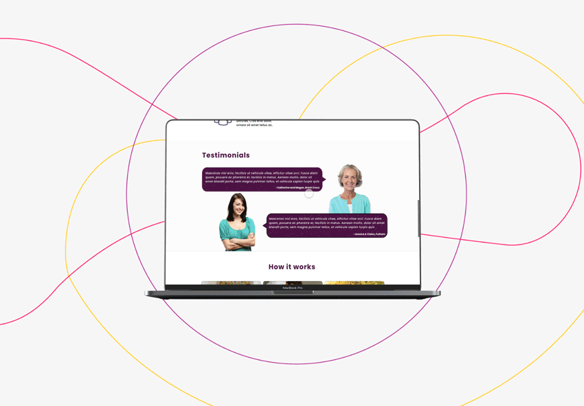
The final UI design- I’ll be showing some features and pages that helped to solve the pain points illustrated in the
problem.
The UI has now been applied over the wireframe for the final design.
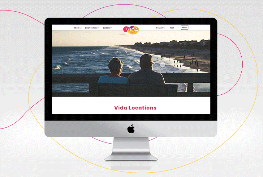

Navigation
Navigation was a pain point for the previous version of the website. Most users stated that they struggled to find important information quickly and caregivers struggled to apply for jobs.
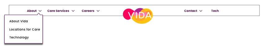
To fix these problems I added navigation with sub-menus so users can quickly find information. I also added a careers section specifically for easy access for caregivers.
Homepage
The Homepage was another big pain point to the users. Some users said the previous homepage was messy with too much information on it.
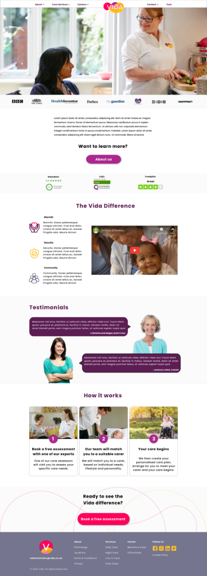
To fix this problem I cleared some information off the homepage, add more white space between elements and made sure the information was engaging to the user based on their VIP’S.
Career Pages
A big problem specifically for the caregivers and Vida was that potential employees were struggling to find caregiver role on the old website.
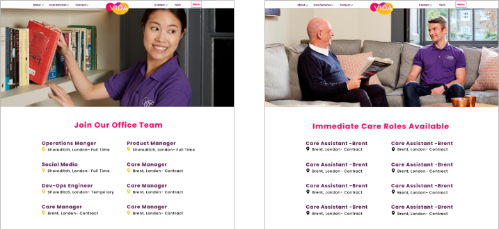
To fix this problem I added careers to the navigation bar and put two different sub-categories for Caregiver roles and in-office roles. Since at the time Vida was growing rapidly, breaking up the career page helped direct caregivers to the correct application.
Technology Page
The last main pain point addressed is for the investor’s persona. This persona found Vida’s previous website geared towards caregivers only and had a hard time finding out about their innovative technology.
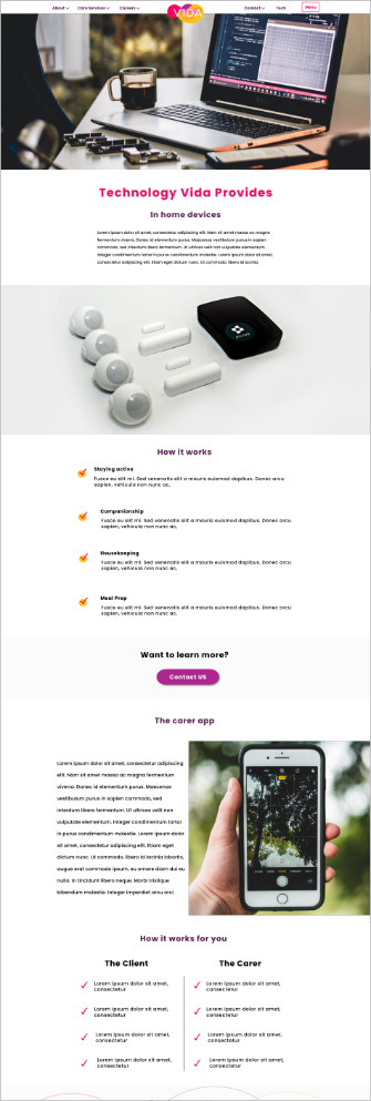
To fix this problem I added a tech page to the navigation bar. This page explains how the technology Vida uses works and how to partner with them.

Phew! That was a lot, but if you are tempted to see more of Vida’s website view the full working prototype (or go to the website).